

How to Get Accurate Print Colours Every Time
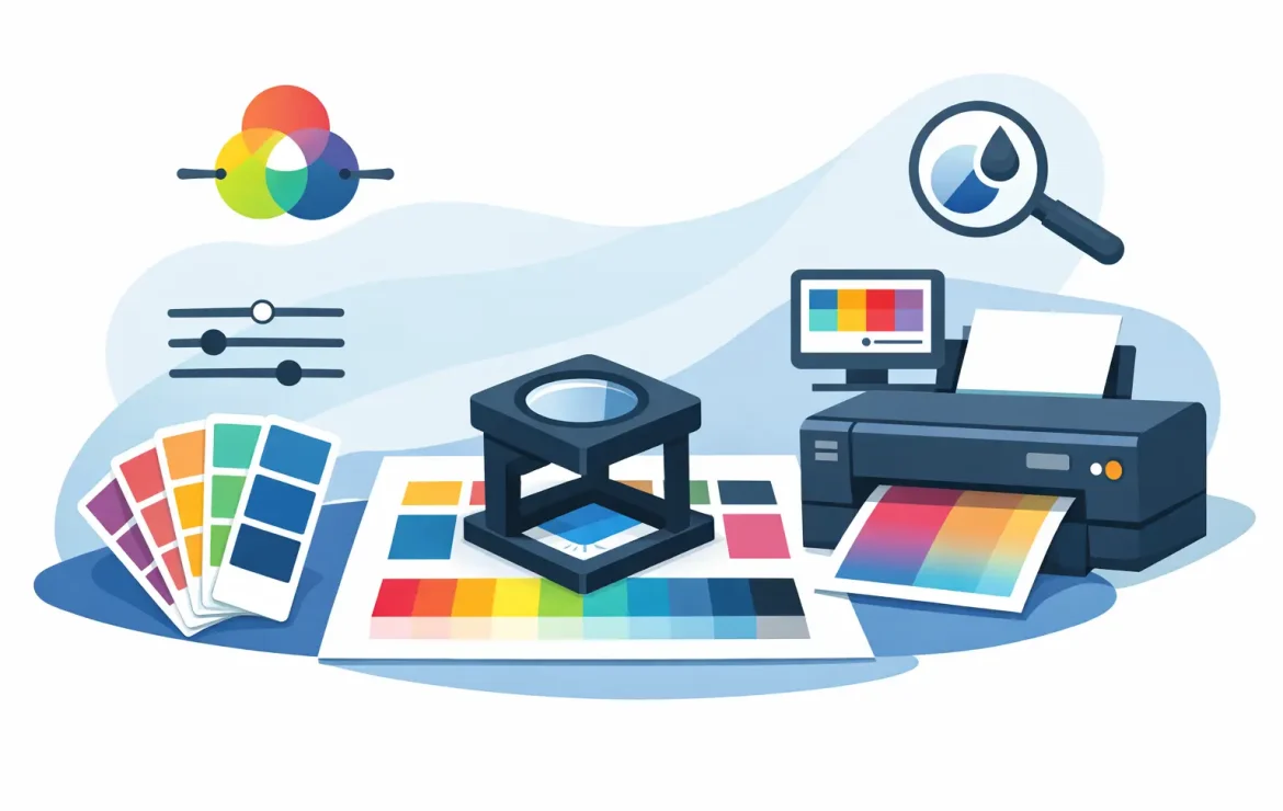
A rich blue logo looks spot on in your browser, but arrives on a leaflet looking purple. A food photograph that felt warm and appetising on screen prints slightly dull. These are common frustrations, but they are avoidable. Knowing how to get accurate print colours comes down to preparing artwork for the physical print process, choosing materials carefully and agreeing expectations before production starts.
Print is not simply a screen image transferred to paper. Your monitor creates colour with light; a press creates it with ink. Once you account for that difference, colour becomes much easier to control – whether you are ordering business cards, brochures, menus, posters or exhibition graphics.
Why screen colours and print colours differ
Screens use RGB colour: red, green and blue light combine to create the colours you see. Printing usually uses CMYK: cyan, magenta, yellow and black inks layered in tiny dots. RGB can display brighter, more luminous colours than CMYK can reproduce, particularly vivid greens, electric blues and fluorescent shades.
That does not mean print cannot look vibrant. It means the artwork needs to be built with print in mind. If an RGB image is sent to print without proper conversion, the print system has to make its best interpretation of colours that sit outside the CMYK range. The result can be a shift that feels surprising, even if the file looked perfect on screen.
Screens also vary wildly. A bright, uncalibrated laptop may make artwork appear more saturated than it really is, while a mobile phone in night mode will alter the whole colour balance. Treat a screen as a useful guide, not the final authority.
Start with a print-ready CMYK file
The simplest way to improve consistency is to create artwork in CMYK from the outset. This allows your designer to see a more realistic approximation of the colours available in print and make sensible adjustments before the job reaches the press.
For professionally designed work, a high-resolution PDF is normally the best file to supply. Images should be 300dpi at their intended print size. Enlarging a small web image may not change its colour, but it will make it soft or pixelated, which can make a polished design look disappointing.
There is one useful exception. If your brand has a very specific corporate colour that must stay consistent across different items and suppliers, a Pantone spot colour may be appropriate. Pantone inks are mixed to a defined formula rather than built from CMYK dots. They are particularly useful for identity-led stationery, packaging and designs with a signature colour. However, they can add cost and are not necessary for every job. A well-prepared CMYK logo is often the most practical choice for full-colour marketing materials.
Be careful with rich blacks
Black deserves special attention. Text, fine lines and small icons should normally be 100% black only. This keeps edges crisp and reduces the risk of coloured outlines if the inks move fractionally during printing.
For a large black background, your printer may recommend a rich black made from a controlled mix of CMYK inks. It creates a deeper, fuller result than black ink alone. The exact mix matters, though, so it is worth asking rather than guessing. Too much ink can cause drying issues or affect the finish of the sheet.
Choose colours that work on the stock
Paper is part of the colour decision, not an afterthought. The same file can look noticeably different on silk, gloss, uncoated or recycled stock.
Coated papers, such as silk and gloss, hold ink nearer the surface. Colours tend to look cleaner, sharper and more saturated. They are often a strong fit for product photography, promotional leaflets and image-led brochures.
Uncoated paper absorbs more ink, giving a softer, more natural appearance. It is popular for premium stationery, artisan brands, invitations and menus where texture matters. However, colours may look less intense than they do on coated stock. A warm white or cream stock will also influence the result, especially in pale areas and photographs.
For wide-format displays, the material is equally important. A poster, roller banner, window graphic and adhesive vinyl do not all reflect light in the same way. If a campaign relies on an exact visual look, make the material part of the conversation early, rather than selecting it after the artwork is approved.
Use proofs for colour-critical work
A proof is the most sensible safeguard when colour matters. It gives you the chance to check copy, layout, image quality and overall colour before the full run is produced.
Not every proof tells you the same thing. A digital PDF proof is excellent for confirming content, positioning and pagination, but it is viewed on a screen and cannot guarantee the final printed colour. A printed proof is more useful for judging the appearance of ink on paper. For especially sensitive work, such as a brand launch, exhibition campaign or high-value client presentation, ask what proofing option best matches the intended production method and stock.
When reviewing a printed proof, look at it under sensible lighting. Daylight is ideal where possible. Yellow indoor lighting can make whites look warmer and alter your perception of blue, grey and neutral tones. Avoid approving colour from a photo of a proof sent by email or WhatsApp: your screen settings will interfere again.
Keep photography and logos under control
Photographs are where colour inconsistencies often become most obvious. Skin tones, food, interiors and branded products can all reveal a colour cast quickly. Use the original, high-resolution image where possible, not one copied from social media or lifted from a website.
If images have been edited by several people, they may each have different colour profiles, contrast levels and white balance. A designer can bring them into line, but only if there is enough quality in the source material. It is better to flag an image you are unsure about before artwork is finalised than to hope it will improve in print.
Logos need the same discipline. Keep one approved master version of each logo, with defined CMYK values for print and RGB or hexadecimal values for digital use. Avoid recolouring a logo by eye in PowerPoint, Canva or an office document. What looks close enough on screen can produce a distinctly different result on paper.
Give your printer the right brief
Good print outcomes are rarely just about software settings. Your printer needs to know what matters most to the job. A restaurant menu might prioritise accurate food photography; a legal firm may need a dependable, understated brand blue; an event team might need posters and roller banners to look consistent together.
Before approving artwork, share the intended product, quantity, paper or material preference, finish and deadline. Mention whether the job needs to match an existing piece of print. If you have an approved sample, provide it. A physical reference is far more useful than saying a colour should be “like the one on our website”.
A quick pre-flight check prevents most avoidable surprises:
- artwork is supplied as a high-resolution PDF;
- images are suitable for print size and set to CMYK where required;
- bleed has been included, usually 3mm for standard printed items;
- important text and logos sit safely away from trim edges; and
- the chosen stock and finish suit the colours and purpose of the piece.
Bleed is not directly about colour, but it matters to how coloured backgrounds and images finish at the edge. Without it, slight movement during trimming can leave an unwanted white line.
Know when a small variation is normal
Even with excellent preparation, print is a physical process. Small variations can occur between print runs, stocks and production methods. Digital print is ideal for short runs and quick-turnaround business materials, while litho print is often the best route for larger quantities and highly consistent colour across a long run. Neither is automatically “better”; the right choice depends on the quantity, artwork, budget and required finish.
The key is to separate acceptable variation from an avoidable mismatch. If your brand relies on a particular shade, establish approved CMYK or Pantone references and use them consistently. If the design uses a full-page photograph or subtle grey background, ask for advice on the stock and proofing route. Clear decisions before print are quicker, calmer and more cost-effective than trying to resolve disappointment afterwards.
Colour accuracy should feel straightforward, not like a technical obstacle. Bring the best artwork you have, be clear about what needs to match, and let an experienced print partner guide the details. At Print by Volta, that is the kind of practical conversation that helps your finished print look as considered as the business behind it.
Popular Posts

A Guide to Custom Sticker Printing for Business

What Is Uncoated Paper and When Should You Use It?

Ordering NCR Duplicate Sets Without Delays
Testimonials
We had some brochures printed – they were high quality and the delivery was right to our door and super speedy. The customer service was excellent and I would definitely use them again.

Causeway
Our friends at Print by Volta always do a cracking job and they are always friendly, helpful and full of ideas. And they are consistent year on year which is why we are still working with them!

LFBB Solicitors
Excellent print quality with a quick turnaround! The staff are very helpful and supportive. We will be sure to work with them again.

David Village Lighting

