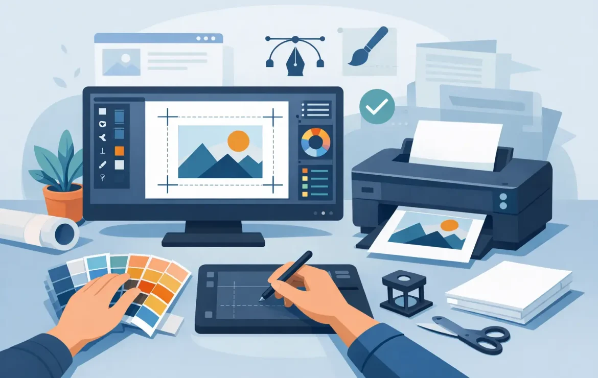
How to Prepare Print Ready Artwork Properly
If you have ever opened a proof and spotted a white edge, fuzzy logo or missing font, you already know why learning how to prepare print ready artwork matters. Small setup mistakes can turn a good design into an expensive reprint, especially when deadlines are tight and the job needs to go straight into production.
The good news is that print-ready artwork is not mysterious. It is simply artwork set up in a way that allows a printer to reproduce it accurately, without having to guess what you meant. Whether you are ordering business cards, brochures, posters or roller banners, the same principles apply.
What print-ready artwork actually means
Print-ready artwork is a file that has been built to the correct size, in the correct colour mode, with the right resolution and enough bleed to trim cleanly. It also needs to include safe margins, properly embedded or outlined fonts, and exported settings that preserve quality.
That might sound technical at first, but most print problems come down to a handful of avoidable issues. A design can look perfect on screen and still fail in print if it has been supplied in RGB, saved at low resolution or built to the wrong dimensions. Preparing the file properly at the start saves time, money and awkward back-and-forth later.
How to prepare print ready artwork from the start
The easiest route is to set your document up correctly before you begin designing. Retrofitting bleed and resizing elements at the end often causes more trouble than it solves.
Start with the finished size
Your document should be created at the final trimmed size of the product. If you are producing an A5 flyer, set the document to A5. If you are designing a folded leaflet or booklet, the page size should match the finished flat or single-page size required for that product.
This is where people sometimes trip up. A social media graphic stretched into a poster layout will not usually print well, and an artwork file designed roughly “around A4” is not precise enough for commercial print. Print works to exact dimensions, so your file should too.
Add bleed from the beginning
Bleed is the extra image area that extends beyond the trim edge. It gives the printer room to cut the sheet cleanly without leaving unwanted white lines at the edge.
A standard 3mm bleed is common for most commercial print jobs in the UK, although some large-format products may need something different. If your background colour, image or graphic runs to the edge of the page, it must extend into that bleed area. If it stops exactly at the trim line, even a tiny movement during finishing can show a white sliver.
Keep key content inside the safe area
Bleed protects the outer edge, but the safe area protects your important content. Text, logos, phone numbers and anything you do not want clipped should sit comfortably inside the trim line, usually at least 3mm to 5mm in from the edge.
This matters more than many people realise. A business card with a logo sitting too close to the edge can feel cramped even if it avoids being cut. Giving content a little breathing room usually improves both print safety and design quality.
Colour choices can change the final result
One of the biggest surprises for customers is colour shift. The bright blue you see on a monitor can print differently on paper, even when the file is technically correct.
Use CMYK, not RGB
For most commercial print, artwork should be supplied in CMYK rather than RGB. RGB is designed for screens, where light creates colour. Print uses ink, so the colour range is different.
If you design in RGB, some colours may appear more vivid on screen than they can be in print. When the file is converted later, those colours can look duller or slightly changed. Building the artwork in CMYK from the start gives you a more realistic view of the printed result.
Be careful with rich black and tints
Not all black is the same in print. For body text, a simple 100% black is usually best because it prints cleanly and keeps small lettering sharp. Large black backgrounds often benefit from a richer black mix to give more depth, but this needs to be handled properly.
Light tints also need care. Very pale colours can look weaker on some stocks, and subtle greys may disappear if they are too faint. If a piece relies on delicate contrast, paper choice and print method can make a real difference.
Images need enough resolution
A common cause of disappointing print is low-resolution imagery. A picture pulled from a website may look fine on a laptop but break up badly when printed.
As a rule, images should be 300dpi at the size they will appear in print. If you enlarge a small image to fill a brochure cover, the quality drops quickly. This is especially noticeable in logos, product shots and detailed photography.
Vector artwork is different. Logos, icons and illustrations created as vectors can scale up without losing quality, which makes them ideal for print. If you have the choice between a pixel-based logo and a vector file, the vector version is usually the safer option.
Fonts and graphics need to travel with the file
You might have the right typeface installed on your computer, but that does not mean it will display properly elsewhere. If fonts are missing when the printer opens your artwork, the layout can shift and the design may reflow in ways you never intended.
The safest options are to embed fonts in the PDF or convert them to outlines if appropriate. Outlining turns text into shapes, which removes the font issue entirely, although it also means the text is no longer editable. That is fine for final artwork, but less helpful if changes are likely.
The same logic applies to placed graphics. Linked images should be included properly when packaging files, or exported into a press-ready PDF so nothing goes missing.
Choosing the right file format
When customers ask how to prepare print ready artwork, what they often mean is, “What file should I send?” In most cases, a high-quality PDF is the best answer.
A properly exported PDF keeps the layout, fonts, images and vector elements together in a format that is reliable for print production. Native design files can be useful in some situations, especially when a printer is helping with amends, but they often come with missing links, unsupported software versions or absent fonts.
For most jobs, a PDF exported using professional print settings is the cleanest handover. If you are unsure, ask what specification is preferred before sending the file rather than after a problem appears.
A few checks before you send anything
Even well-designed artwork benefits from a final pre-flight check. This is the stage where you stop designing and start checking the file as a printed product.
Read every word again. A spelling mistake on screen is irritating. A spelling mistake on 5,000 leaflets is expensive. Check phone numbers, email addresses, dates, prices and postcodes just as carefully as the design.
Then check the mechanics. Is the document size correct? Is bleed included? Are images high enough in resolution? Have all fonts been embedded or outlined? Is the file in CMYK? If the piece folds, have you allowed for panel sizes and creep where needed? These details are not glamorous, but they are what make artwork printable.
When it is worth asking for help
Some artwork files are straightforward. Others involve folds, multiple pages, die cuts, spot colours, oversized formats or tight branding rules. In those cases, getting advice before the file is final can save a lot of time.
That is particularly true for businesses producing campaign materials across several formats. A brochure, poster, sticker and roller banner may all share the same branding, but they do not behave in the same way in production. Resizing one design across every item is rarely the best approach.
At Print by Volta, we often find that a quick conversation at the start prevents the usual print issues later. That could mean checking artwork dimensions, flagging a colour concern or helping refine a supplied file so it prints as well as it looks.
Good print should not feel like a test. If your artwork is prepared properly, the job moves faster, the result is cleaner and everyone has more confidence in the final piece.
The best habit is simple: design for print, not just for the screen. Do that, and your artwork has every chance of arriving exactly as you intended.
Popular Posts

How to Design Exhibition Banners That Work

A Guide to Commercial Print Buying

A Guide to Business Leaflet Printing
Testimonials
We had some brochures printed – they were high quality and the delivery was right to our door and super speedy. The customer service was excellent and I would definitely use them again.
Causeway
Our friends at Print by Volta always do a cracking job and they are always friendly, helpful and full of ideas. And they are consistent year on year which is why we are still working with them!
LFBB Solicitors
Excellent print quality with a quick turnaround! The staff are very helpful and supportive. We will be sure to work with them again.