

How to Choose Poster Size for Your Campaign
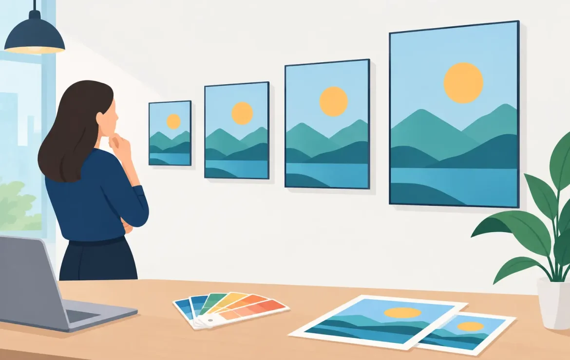
A poster can have excellent branding, a strong offer and beautifully designed artwork, yet still be ignored if it is the wrong size for its setting. Knowing how to choose poster size starts with one practical question: where will people see it, and how far away will they be when they need to understand the message?
A poster in a café window has a very different job from one promoting an exhibition in a busy venue, or directing visitors around a conference. The right format helps your message get noticed quickly, fits the available display space and keeps your print spend sensible.
Start with where the poster will be displayed
The display location should lead the decision, not the size of a previous design file. Consider whether the poster will be viewed indoors or outdoors, mounted in a frame, placed in a window, attached to a noticeboard or displayed on an easel. Measure the usable space rather than estimating it.
For example, a poster intended for a reception desk may only need to be A4. It is close to the reader and can share detailed information such as dates, prices, QR codes or contact details. The same artwork at A4 would be far too small for a shop window facing a pavement, where passers-by need to recognise the key message in a few seconds.
Also think about what surrounds the poster. A3 can work well on a clear wall, but may disappear among dozens of other notices. A larger format gives your campaign more presence, although it only pays off if the design has enough impact to use the additional space well.
How to choose poster size by viewing distance
As a straightforward rule, the further away the audience stands, the larger the poster and its headline need to be. The goal is not for someone to read every word from across a room. It is for them to spot the main message, logo or call to action and choose to come closer.
A4 posters: close-up information
A4 measures 210 x 297 mm. It is a practical choice for counter displays, staff areas, toilets, community noticeboards, table displays and information points. It is affordable, easy to frame and simple to distribute across multiple locations.
Use A4 when the audience is likely to stand within arm’s reach. It suits price lists, event details, recruitment notices, promotions at the point of purchase and internal communications. Keep the headline clear, but you can include more supporting detail than you would on a larger poster.
A3 posters: the everyday all-rounder
A3 measures 297 x 420 mm and is one of the most versatile poster sizes for business use. It has enough room for a confident headline, a strong image and key details without overwhelming smaller spaces.
It works particularly well for retail promotions, hospitality offers, local events, venue noticeboards and posters displayed around offices, schools and public-facing premises. If people will view the poster from a few metres away, A3 is often the sensible starting point.
A2 posters: visibility in busy spaces
At 420 x 594 mm, A2 gives a campaign noticeably more presence. This is a strong option for shop windows, reception areas, event entrances, corridors, wall displays and promotional boards where competing messages are likely.
Choose A2 when the poster needs to catch attention before a reader is close enough to take in the detail. It is also useful when your design relies on a product image, photography or a large headline that needs room to breathe.
A1 and A0 posters: distance and high impact
A1 measures 594 x 841 mm, while A0 measures 841 x 1189 mm. These larger sizes are designed for visibility, not dense information. They suit exhibitions, open days, presentations, large retail spaces, building sites, directional signage and event displays.
With A1 or A0, less is usually more. A large-format poster crowded with small text will still be hard to read. Use a bold headline, a limited number of supporting points and a clear next step, such as visiting a stand, scanning a code or speaking to a member of staff.
Match the message to the format
Poster size and content have to work together. If your message includes an event name, date, venue, sponsors, ticket information and several offers, a small poster can quickly become cluttered. Equally, a simple two-word promotion can look lost on A0 if the artwork is not designed for that scale.
Think about the order in which someone will read it. The headline should be visible first, followed by the main benefit or event detail, then the action you want them to take. If a reader has to search for the date, price or contact information, the poster is doing too much work.
This is where professional artwork makes a real difference. Enlarging an A4 design to A1 does not automatically create an effective A1 poster. Text proportions, image quality, spacing and the amount of information often need adjusting for the larger format.
Check portrait, landscape and custom dimensions
Standard A sizes are popular because frames, display systems and mounting materials are widely available. They are also easy to order and compare. However, portrait is not always the right orientation.
Portrait posters are natural for window displays, noticeboards and information-led designs. Landscape formats can be better for menus, panoramic photography, directional messages, wide retail displays or artwork with a horizontal logo. The available space may make the choice for you.
Custom-sized posters are worth considering when you have a non-standard frame, a specific exhibition panel or a display area that standard sizes do not use efficiently. Before choosing a bespoke dimension, check how it will be mounted and whether it can be reused. A standard A2 poster may be the more cost-effective choice if it fits the purpose just as well.
Consider paper, finish and durability
Size is only one part of the decision. A poster in a busy public area needs a finish that suits its environment. Gloss can make colours appear vibrant and works well for bold promotional artwork, but reflections can be an issue under bright lighting. Matte or silk finishes are often easier to read where glare is likely and can give a more understated, premium feel.
For short-term indoor promotions, a standard poster stock is usually appropriate. For window displays, frequently handled posters or material that needs to last, a heavier stock or protective finish may be a better investment. Outdoor use brings further considerations, including weather exposure, fixing methods and how long the poster needs to remain presentable.
Do not assume bigger always means better. A large poster printed on unsuitable stock, mounted poorly or placed where it cannot be read will not deliver value. The best result comes from matching size, material and location from the outset.
Keep budget and quantities in proportion
A campaign often needs more than one poster size. You might use A1 at the entrance to an event, A3 around the venue and A4 at counters or tables. This creates a consistent campaign while giving each poster a clear role.
If you need posters across several branches or locations, ask how many will go in each setting before ordering. It may be more effective to print fewer large posters for high-traffic areas and use A4 or A3 formats for supporting information. This keeps the campaign visible without paying for large-format prints where they are not needed.
It is also worth planning for replacements. Posters in public spaces can be damaged, removed or covered by other notices. Ordering a small spare quantity can save a last-minute scramble later.
Prepare artwork at the final print size
Once you have selected the format, build the artwork for that finished size. Images need enough resolution to remain sharp, particularly on A1 and A0 posters. Logos should be supplied in a suitable high-quality format, and text needs a comfortable margin from the edges so that important details are not too close to the trim.
Allow for bleed where artwork or colour runs to the edge of the page. Keep vital information, including QR codes, phone numbers and dates, within a safe area. A QR code is only useful if it is large enough to scan easily from the expected reading distance.
If you are unsure whether the artwork is suitable, getting a print professional to check it before production is usually far easier than discovering an issue once the posters are on display. Print by Volta can help businesses turn an initial idea or existing design into a poster format that fits the campaign and the space available.
Before approving the job, picture the poster in its real setting. Stand at the likely viewing distance, imagine the competing signs around it and ask whether the headline still earns attention. That small check is often what turns a poster from simply printed into properly noticed.
Popular Posts

How to Choose Poster Size for Your Campaign

How to Prepare Files for Litho Print Jobs

Wide Format Displays That Get Your Brand Seen
Testimonials
We had some brochures printed – they were high quality and the delivery was right to our door and super speedy. The customer service was excellent and I would definitely use them again.

Causeway
Our friends at Print by Volta always do a cracking job and they are always friendly, helpful and full of ideas. And they are consistent year on year which is why we are still working with them!

LFBB Solicitors
Excellent print quality with a quick turnaround! The staff are very helpful and supportive. We will be sure to work with them again.

David Village Lighting

