

Window Graphics That Make Your Premises Work Harder
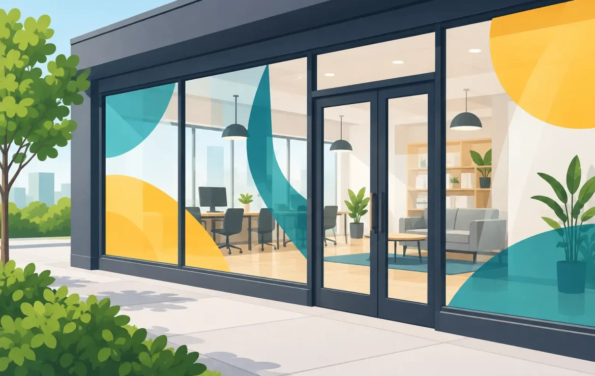
A blank shopfront, reception window or meeting-room partition is valuable space going unused. Window graphics turn that glass into a clear message for customers, visitors and passers-by – whether you need to announce an offer, make your entrance easier to find, add privacy or simply make the premises look more like your business.
For businesses across Sheffield and South Yorkshire, the right graphics can do several jobs at once. They create a stronger first impression, carry your brand beyond a sign above the door and give people a reason to stop rather than walk past. The key is choosing a finish and design that suit the location, the amount of natural light and what you want the window to achieve.
What window graphics can do for your business
Window graphics are printed or cut vinyl designs applied directly to glass. They are used on shop windows, office fronts, internal glass walls, salon mirrors, hospitality venues, vehicles with glass panels and exhibition displays. They can be temporary for a campaign or event, or designed to remain in place for years.
Their appeal is practical. A retail window can show opening hours, featured products and seasonal offers without needing extra posters inside. A street-facing office can display a logo and contact details while still allowing daylight in. Frosted graphics on meeting rooms make confidential conversations feel more private without closing off the space with solid walls.
They are also useful when the premises are hard to spot. Clear, well-positioned branding on the glass helps visitors know they have reached the right entrance. This matters for professional services, shared buildings and businesses located above street level, where a small amount of clear signage can remove unnecessary confusion.
The strongest projects start with one question: what should someone understand within a few seconds of seeing this window? If the answer is an offer, prioritise the offer. If it is wayfinding, prioritise the business name and directions. Trying to fit every service, social handle and sales message into one pane usually weakens the result.
Choosing the right type of window graphic
There is no single best material. The right choice depends on how much privacy you need, whether the design is viewed from inside or outside, how long it will be displayed and the condition of the glass.
Full-colour printed vinyl
Printed vinyl is the flexible option for photographs, detailed brand artwork, promotional messages and bold blocks of colour. It works well for shop campaigns, café windows, estate agent displays and large branding statements. A matt finish can reduce reflections, while gloss can make colours appear more vibrant, though it may show glare in bright locations.
For a short-term campaign, removable vinyl can make sense. It gives you the freedom to update messages as stock, seasons or events change. For longer-lasting branding, a more durable adhesive is normally the better investment. It is worth deciding this before production rather than treating every graphic as temporary by default.
Frosted and etched-effect vinyl
Frosted vinyl is popular in offices, clinics, salons and meeting spaces because it softens visibility while keeping the room bright. It can cover an entire lower section of glass or be cut into a logo, pattern or stripe. The effect is smart and understated, making it particularly useful when a full-colour display would feel out of place.
Privacy is not absolute, however. Frosted film obscures detail but may still show movement and shapes in certain light. If the graphic is being used for a consultation room or an area handling sensitive information, discuss the level of coverage required rather than assuming a light frosted pattern will be enough.
One-way vision film
One-way vision film has small perforations that allow people inside to see out while presenting a printed design to people outside. It is often used for storefronts, gyms and promotional windows where visibility from the street matters but staff still need daylight and a view outside.
The trade-off is that the image is not as solid or sharp at close range as regular vinyl. It also performs differently after dark, especially when the interior is brightly lit. It is a good solution in the right setting, but the artwork and placement need planning around the lighting conditions.
Cut vinyl lettering
For opening times, web addresses, simple logos and legal information, cut vinyl lettering is clean, durable and easy to read. It does not need a printed background, so it can look less cluttered than a large full-colour panel. This is often the best route when you need professional information on the door or front window without obscuring the view inside.
Design window graphics for a quick read
A window is not a brochure. Most people will see it while walking, driving or looking for a specific destination, so the message needs to work at a glance. Large type, strong contrast and enough empty space are more valuable than lengthy copy.
Start with the hierarchy. Your business name or campaign headline should be the first thing people notice. The next level might be a short supporting message, product category or call to action. Phone numbers, opening times and website details can sit lower down, where they remain available without competing for attention.
Colour matters, especially on glass. A pale logo that looks fine on a computer screen may disappear against reflections, bright skies or whatever is visible inside the building. Likewise, a dark graphic can become hard to read when placed over a dark interior. A professional proof helps, but a quick look at the window itself at different times of day can prevent an expensive mistake.
Avoid covering every inch of glass simply because it is available. A partially covered window can look more confident, preserve light and make the main message easier to absorb. This is particularly relevant for cafés, retailers and venues where customers want to see that the space is open, welcoming and active.
Measure properly before anything goes to print
Accurate measurements are the foundation of a tidy installation. Measure each pane separately, even if the windows appear identical, and note handles, frames, seals, mullions and any existing manifestations. Take photographs from inside and outside, then mark up where the graphic will sit.
Remember that artwork dimensions and finished graphic dimensions are not always identical. Depending on the application, extra material may be needed for trimming, alignment or wrapping around an edge. Large designs may also be produced in sections, so important text and logo details should not fall across a join.
If the graphic needs to be read from the outside but applied internally, the artwork must be prepared in reverse and may require suitable materials to keep the colours looking right through the glass. This is a small production detail with a big visual impact, and it is one reason it pays to involve your printer early.
Plan installation around the site
A beautifully printed graphic can still look poor if it is applied to dirty, damaged or damp glass. Windows should be clean, dry and free from silicone residue or old adhesive. Installation is also easier when the area is clear of furniture, displays and foot traffic.
For large windows, high-level glazing or detailed multi-panel designs, professional fitting is usually the sensible choice. It reduces bubbles, creases and alignment issues, while ensuring the finished work looks considered rather than improvised. Smaller cut-vinyl messages may be suitable for self-application, but only if you are comfortable taking the time to position them carefully.
Think ahead about maintenance too. Window cleaners should know where graphics have been applied and avoid aggressive scraping or unsuitable chemicals. When it is time to refresh a campaign, removal should be planned with the age and adhesive strength of the film in mind. A temporary graphic left in place for several years will not always peel away as easily as it did on day one.
Make the window part of the wider brand
Your premises should feel connected to the rest of your marketing. Use the same logo treatment, colours and tone of voice seen on your business cards, leaflets, menus, signage and online channels. Consistency makes a local business easier to recognise, and it gives customers confidence that they are dealing with an organised, established team.
That does not mean every window must look identical. A retailer may need bold, frequently changing promotions, while a solicitor’s office may benefit from restrained frosted branding and clear door information. The best approach reflects the business, the building and the audience rather than following a generic template.
When you are ready to update your glass, bring together a few photographs of the site, rough measurements and a clear idea of what the message needs to achieve. From there, the job becomes much more straightforward – and your windows can start earning their space.
Popular Posts

A Practical Guide to Direct Mail Printing

Window Graphics That Make Your Premises Work Harder

Best Stationery for New Businesses to Start With
Testimonials
We had some brochures printed – they were high quality and the delivery was right to our door and super speedy. The customer service was excellent and I would definitely use them again.

Causeway
Our friends at Print by Volta always do a cracking job and they are always friendly, helpful and full of ideas. And they are consistent year on year which is why we are still working with them!

LFBB Solicitors
Excellent print quality with a quick turnaround! The staff are very helpful and supportive. We will be sure to work with them again.

David Village Lighting

