

Matte Versus Gloss Lamination: Which Fits?
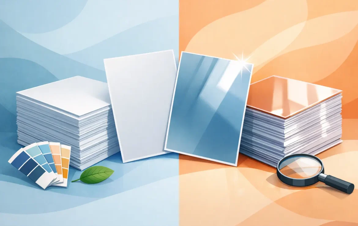
A business card can feel premium or promotional before a word has been read. A brochure can look calm and considered, or bright enough to pull attention from across a counter. That is why the choice between matte versus gloss lamination matters more than it might first appear. It is not simply a finishing detail – it helps determine how your print looks, feels and performs in the real world.
For many business print jobs, there is no single ‘best’ option. The right finish depends on your brand, where the item will be used, how often it will be handled and what you need it to achieve. A shiny restaurant menu, for example, has different priorities from a sophisticated presentation folder for a professional services firm.
What lamination does for printed materials
Lamination is a thin protective film applied over printed paper or card. It gives the surface added strength and helps protect it from everyday handling, light moisture, marks and scuffs. It is commonly used on business cards, brochures, menus, postcards, presentation folders, book covers and premium leaflets.
As well as offering protection, lamination changes the character of the printed piece. A finish can soften colours, intensify them, reduce glare or make the surface feel more substantial. This is why it should be considered during the design and print planning stage, rather than treated as a last-minute upgrade.
It is also worth remembering that lamination is not always necessary. A short-lived event leaflet, a large-volume flyer or an internal handout may be better produced without it, particularly where budget is the main concern. For customer-facing pieces that need to last, however, it can be money well spent.
Matte versus gloss lamination: the visual difference
Gloss lamination has a smooth, reflective shine. It makes colours appear more vivid and can give photographs, bold graphics and high-contrast designs extra impact. If your artwork includes rich product imagery, colourful branding or strong blocks of colour, gloss can make those elements feel more energetic.
Matte lamination has a non-reflective, understated surface. Colours can appear slightly softer, while the overall result feels refined and contemporary. It is often chosen by businesses that want a polished look without visual noise, especially when the design uses plenty of white space, muted tones or carefully selected typography.
Neither finish improves poor artwork. If a logo is low resolution, a photograph is too dark or the text is cramped, lamination will not hide it. What it will do is amplify the intended personality of a well-designed piece. Gloss tends to add confidence and punch; matte tends to add restraint and quality.
Matte lamination: calm, premium and easy to view
Matte is a popular choice for brands that want a professional, high-end feel. It reduces reflections, which makes it easier to read under bright office, retail or venue lighting. This can be particularly useful for menus, information packs, brochures and folders that people will read closely.
It also works beautifully with minimalist design. A clean black logo on a pale background, for instance, can feel far more expensive with a matte finish than with a reflective surface. Estate agents, solicitors, architects, creative studios and professional service businesses often favour this quieter approach, though it can work equally well for premium hospitality and retail brands.
Matte is not completely mark-proof. Very dark, solid-colour designs can show handling marks or rub marks more readily than lighter designs, especially on items passed around frequently. It is worth discussing this early if you are planning a black or deep navy business card, folder or booklet cover.
Gloss lamination: bright, bold and attention-grabbing
Gloss is a strong option when you need colour to work hard. It suits vibrant product photography, promotional postcards, retail leaflets, takeaway menus and marketing materials designed to catch the eye quickly. A gloss-finished flyer can make food look fresher, colours look richer and imagery look more immediate.
The reflective finish does mean glare can be an issue in certain settings. Under spotlights, near windows or in bright exhibition spaces, some angles can be harder to read. This is rarely a reason to rule gloss out altogether, but it is a practical consideration for text-heavy materials.
Gloss can also show fingerprints, particularly on dark backgrounds. On the other hand, its smooth surface is easy to wipe clean, which is useful for menus, price lists and frequently handled promotional pieces. Context matters more than any blanket rule.
Match the finish to the job, not just the trend
Choosing lamination becomes easier when you start with the purpose of the printed item. A luxury invitation, annual report cover or corporate folder may benefit from the reserved confidence of matte. A product launch leaflet, a seasonal offer card or a colourful hospitality menu may get more value from gloss.
For business cards, both finishes can work well. Matte is excellent for a subtle, design-led brand, while gloss can be ideal when your identity relies on bright colour or photography. For brochures and booklets, consider the cover and the inside pages separately. A laminated cover provides useful protection and a premium first impression, while unlaminated text pages may be more practical and economical.
If you are producing a roller banner or poster, lamination is a different conversation. Wide-format materials use different media and protective finishes, so the best option will depend on where the display is going and how long it needs to be used. The principle is the same: select a finish that supports the setting and the message.
Think about colour, design and readability together
A finish should support your brand palette rather than fight it. Bright reds, blues and greens generally appear especially lively under gloss. Fine type, subtle tonal differences and understated colour schemes often sit more comfortably on matte. That said, there are useful exceptions. A high-fashion style campaign can use gloss deliberately for a striking editorial feel, while a colourful children’s brand may choose matte to create a modern, tactile result.
Dark designs deserve extra care. Matte black can look exceptional, but it may need more careful handling than a lighter or textured design. Gloss black offers drama and depth but can reveal fingerprints and reflections. If the item will be carried in pockets, placed on tables or handled repeatedly at an event, ask for advice before committing to a large run.
Lamination also affects what can happen after printing. Writing on a laminated surface is not as straightforward as writing on uncoated paper, although certain permanent markers may work. If customers need to complete a form, add notes or collect a stamp, it may be better to leave part of the design unlaminated or use a different stock and finish.
Durability is valuable, but it has limits
Both matte and gloss lamination add a useful layer of protection. They can help printed materials withstand routine handling and make card-based products feel more durable. This is particularly helpful for price lists, menus, folders and business cards that need to stay presentable over time.
However, laminated print is not indestructible. Corners can still bend, edges can wear and heavy use will eventually show. The weight and quality of the stock underneath also make a difference. A thick card with lamination will generally feel more substantial than a lightweight stock with the same finish.
For folded pieces, production method matters too. Laminated card normally needs to be creased before folding to reduce the risk of cracking along the fold. This is the sort of detail a print partner should handle as part of planning, rather than leaving you to discover after delivery.
Is matte or gloss lamination more expensive?
The price difference between matte and gloss is often small, but costs vary according to size, quantity, stock, whether one or both sides are laminated, and the complexity of the item. A folded brochure, for example, involves different production considerations from a flat postcard or set of business cards.
The better question is whether lamination earns its place in the budget. If it helps a menu survive months of use, makes a presentation folder feel credible in a sales meeting or gives a postcard campaign a stronger visual pull, the extra spend can be justified. If the item is intended for a brief one-off promotion, a good-quality unlaminated finish may be the more sensible choice.
A straightforward way to make the choice
Start by looking at where the item will be seen. For close reading in bright rooms, matte often has the advantage. For a display designed to attract attention quickly, gloss is frequently the stronger contender. Next, consider your artwork. Is it driven by elegant type and restrained colour, or by vivid imagery and bold offers?
Then think about handling. A premium business card exchanged at meetings has different demands from a café menu cleaned several times a day. Finally, do not choose from a screen alone if the finish is central to the job. Holding printed samples under normal lighting is the quickest way to see how your colours, images and brand style will translate.
A straightforward conversation before print can save a costly compromise later. At Print by Volta, the aim is to make that decision clear, practical and suited to the job – so the finished piece feels right in your customer’s hands, not just on a PDF.
Popular Posts

What Is Uncoated Paper and When Should You Use It?

Ordering NCR Duplicate Sets Without Delays

Design Print Services That Get Results
Testimonials
We had some brochures printed – they were high quality and the delivery was right to our door and super speedy. The customer service was excellent and I would definitely use them again.

Causeway
Our friends at Print by Volta always do a cracking job and they are always friendly, helpful and full of ideas. And they are consistent year on year which is why we are still working with them!

LFBB Solicitors
Excellent print quality with a quick turnaround! The staff are very helpful and supportive. We will be sure to work with them again.

David Village Lighting

