

Print Proofing Checklist Before You Send
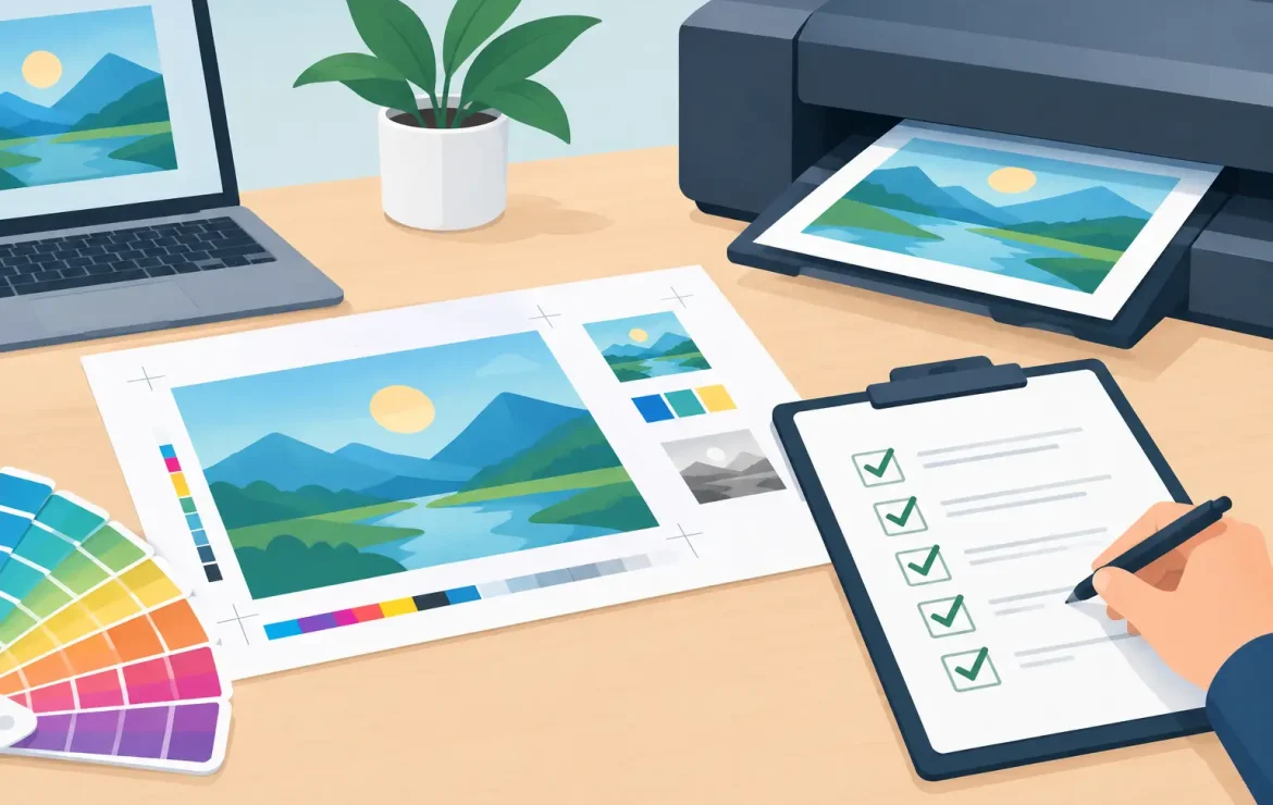
A missed digit in a telephone number, a logo that sits too close to the edge, or a dark background that makes small text hard to read can turn an otherwise strong piece of marketing into an expensive problem. This print proofing checklist gives your team a clear final check before approving artwork, whether you are ordering business cards, brochures, menus, exhibition graphics or everyday leaflets.
Proofing is not about finding fault with the designer or holding a job up for the sake of it. It is the last chance to make sure the printed item does the job you need it to do. A few focused minutes at this stage can protect your budget, your deadline and your brand.
Print proofing checklist: start with the message
Before looking at technical settings, read the artwork as your customer would. Step away from the file for ten minutes if you can, then return to it with fresh eyes. It is surprisingly easy to miss an error when you know what the wording is meant to say.
Check every word, number and date
Read all headlines, body copy, captions, terms and calls to action. Pay particular attention to contact details, website addresses, email addresses, prices, QR codes, event dates and opening times. These are the details people rely on, and they are often the most costly to correct after printing.
Do not assume content copied from a previous leaflet or brochure is still current. A member of staff may have changed, a postcode may be wrong, or an offer may have expired. If the piece includes a QR code, test it from a mobile phone using the final proof rather than relying on the original code supplied.
Make the next step obvious
Ask a simple question: after reading this, does the customer know what to do next? Your phone number, booking instruction, offer code or web address should be easy to find and easy to understand. A proof can look attractive but still fail if its main message is buried in a busy layout.
For menus, price lists and operational forms, check that the information works in the order a person will use it. For event posters and roller banners, look at whether the key message can be understood quickly from a distance.
Confirm approvals and legal details
If different people own the wording, pricing, brand or compliance sign-off, make sure each person has seen the same final version. This matters for regulated sectors, promotional terms, financial information and any printed material carrying a legal notice.
Avoid collecting edits through several versions of an email chain. One named person should hold the approved PDF and confirm that it is the version going to print. It is a small bit of organisation that prevents old artwork finding its way back into the job.
Check the design works on the page
A PDF on screen can disguise layout issues. Zoom out to view the whole page, then zoom in closely to inspect the details. If possible, print the proof on an office printer at actual size. It will not match the final print quality or colour, but it is useful for judging scale, spacing and readability.
Check that your logo is sharp, correctly positioned and using the right version. Look for stretched images, uneven margins, awkward line breaks and text that sits too close to the trim edge. On folded leaflets and booklets, make sure copy will not disappear into a fold, spine or crease.
Small text reversed out of a dark or coloured background needs particular care. It may be technically printable, but very fine lettering can lose clarity depending on the stock, print process and design. In some cases, a slightly larger type size or a simpler colour treatment is the better choice.
Images deserve a close look too. Check that they are relevant, cropped well and clear at their intended size. A photograph can appear acceptable on a laptop but reproduce softly if the original file is too small. Enlarging a low-resolution image will not create extra detail.
Check the file is built for print
A print-ready PDF should be supplied at the final finished size, with the correct number of pages and a sensible file name. If a job has several versions, such as regional flyers or personalised inserts, label them clearly so there is no confusion in production.
Most print jobs need bleed, usually 3 mm, where background colours, photos or design elements run to the edge of the page. Bleed gives the guillotine a little room for movement during trimming. Without it, you may see an unwanted white line around the edge.
Keep important text, logos and borders inside a safe area from the trim. There is no single distance that suits every product, particularly with booklets, folded work and large-format display items, but a cramped edge nearly always looks less professional. A design team can advise where the safe area should be for the product you are ordering.
Use CMYK artwork for standard full-colour print where possible. RGB colours are designed for screens and can look brighter or different once converted for print. Pantone or spot colours may be appropriate when a precise brand colour is essential, but they can affect the production method and cost. The right approach depends on the item, quantity and how critical the colour match is.
Make sure fonts are embedded or converted appropriately in the final PDF. Missing fonts can cause text to reflow or substitute unexpectedly. If your artwork contains transparency, fine lines or specialist effects, sending a high-quality print PDF rather than an editable working file reduces the chance of surprises.
Proof colour, stock and finishes where they matter
Colour is one of the most common areas for uncertainty because screens, office printers and commercial presses do not reproduce colour in exactly the same way. Bright blues, deep blacks, subtle greys and brand-critical shades are worth discussing before production, especially when matching an existing brochure, sign or campaign.
A digital screen proof is excellent for checking content, layout and general appearance. It is not always a reliable guide to final colour, texture or how a finish will feel. If colour accuracy is especially important, ask whether a physical proof or a printed sample is the sensible option for your project.
Paper stock changes the result as much as many people expect. A silk leaflet, an uncoated menu and a thick matt business card can all carry the same artwork but create very different impressions. Uncoated stocks tend to feel more natural and can soften colour; coated stocks often give photographs and solid colours more punch. There is a budget consideration too, so choose the stock that suits the purpose rather than simply the heaviest option.
Check that any special finish is clearly shown and described. Lamination, spot UV, foiling, die cutting, folding, drilling and white ink on coloured stock all need precise instructions. A visual mock-up helps, but a note identifying exactly where the finish applies removes ambiguity.
Confirm quantities, versions and practical details
The most polished artwork still causes problems if the order details are wrong. Before approval, confirm the quantity, finished size, page count, orientation, paper choice and any finishing requirements. For booklets, confirm the pagination is correct and that blank pages have not been included by accident.
If you need multiple versions, state the quantity for each version rather than just the total. For example, a campaign may need separate leaflets for Sheffield, Rotherham and Doncaster, each with its own contact details. Make it clear whether these are different files or simply different quantities of the same design.
Think about how the print will be used after delivery. Posters may need to fit existing frames, roller banners need the correct visible area, and menus may need lamination for regular handling. Labels and stickers should be checked against the surface they will be applied to. Practical use is often where the best last-minute questions arise.
Give approval with confidence
The person approving print should see the final, supplied PDF and the full job specification together. Approving a screenshot, an earlier draft or a verbal description leaves room for misunderstandings. If something is unclear, ask before giving the go-ahead. It is always easier to resolve a question at proof stage than after a run has been produced.
A reliable print partner will be happy to flag obvious concerns, but the final approval remains your opportunity to confirm that the artwork says exactly what you mean. Keep this checklist close, and your printed materials will arrive ready to represent your business properly – clear, considered and fit for purpose.
Popular Posts

A Guide to Custom Sticker Printing for Business

What Is Uncoated Paper and When Should You Use It?

Ordering NCR Duplicate Sets Without Delays
Testimonials
We had some brochures printed – they were high quality and the delivery was right to our door and super speedy. The customer service was excellent and I would definitely use them again.

Causeway
Our friends at Print by Volta always do a cracking job and they are always friendly, helpful and full of ideas. And they are consistent year on year which is why we are still working with them!

LFBB Solicitors
Excellent print quality with a quick turnaround! The staff are very helpful and supportive. We will be sure to work with them again.

David Village Lighting

