

How to Design Exhibition Banners That Work
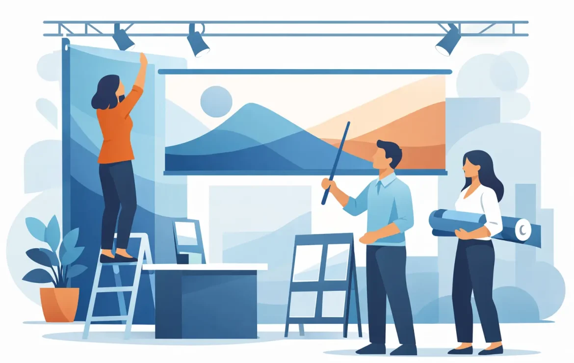
A busy exhibition hall gives you only a few seconds to make an impression. People are walking, talking, scanning stands and deciding where to stop almost without thinking. That is why knowing how to design exhibition banners properly matters – a banner is not just a backdrop, it is often the first thing people notice about your business.
The good news is that effective exhibition banner design is rarely about cramming in more. In most cases, the strongest banners are the clearest ones. They help people understand who you are, what you do and why they should come closer, all at a glance.
Start with the job the banner needs to do
Before you pick colours, images or headline styles, get clear on purpose. Exhibition banners can do different jobs. Some are there to build brand presence from across the room. Others are meant to support a sales conversation on the stand. Some need to launch a new product, while others simply need to make a small space look polished and professional.
That purpose affects every design choice that follows. If the banner needs to catch attention from a distance, bold messaging and simple layouts matter most. If it will sit behind a table where visitors are already stopping to chat, you can afford to include a little more supporting detail. The mistake many businesses make is trying to force one banner to do everything at once.
A useful question is this: what is the one thing you want a passer-by to remember after seeing it for three seconds? If you can answer that clearly, the design usually becomes much easier.
How to design exhibition banners for quick reading
Exhibition banners are not brochures. People do not stand in an aisle hoping to read paragraphs of copy. They glance, judge and move on unless something catches them. That means your design has to be built for speed.
Your main headline should be short, clear and easy to read from a distance. In many cases, fewer words create more impact. A strong headline tells visitors what you offer, not just your company name. If your brand is not widely known, leading with the logo alone may waste valuable space.
Supporting text should be brief and selective. Think in layers. First, someone sees the headline. Then they notice a secondary line that adds context. Then, if they are closer, they might read a few key benefits or services. This is very different from trying to explain your whole business in one panel.
If you are deciding what to cut, trim anything that is not essential to starting a conversation. Contact details, long descriptions and dense service lists often belong on leaflets or brochures rather than the banner itself.
Keep the message high on the stand
A practical point that gets overlooked is banner height. The lower section of a roller banner can be blocked by tables, chairs, literature stands or people standing in front of it. Put your most important message in the upper and middle areas, where it stays visible.
This matters just as much for logos and calls to action. If the crucial information sits near the bottom, there is a good chance your audience will never see it.
Design for distance, not for your screen
A banner that looks sharp on a laptop does not always work in a real venue. Exhibition spaces are visually noisy, with competing colours, lighting conditions and lots of movement. Your design needs enough contrast and scale to hold up in that environment.
Large text is your friend. So is white space. Trying to fill every part of the banner usually weakens it because nothing stands out. Give the important elements room to breathe so people can process them quickly.
Contrast is another big factor. Pale grey text on a white background may look elegant on screen, but it can disappear in a brightly lit hall. Dark text on a light background, or light text on a dark block of colour, is usually safer for readability. If your brand palette is subtle, you may need to use it selectively rather than applying it everywhere.
Images need the same level of discipline. One strong, high-resolution image can be far more effective than several smaller ones fighting for attention. If the photo is busy or low quality, it can make the whole banner feel less professional, even if the printing itself is excellent.
Make branding obvious, but not overpowering
Most businesses want their branding to be front and centre, and that makes sense. You want people to recognise you. But there is a difference between visible branding and banner designs that are swallowed by logos, badges and brand graphics.
Your logo should be easy to spot, but it should not compete with the main message. For many exhibition banners, the best approach is a clear logo near the top, a concise headline beneath or beside it, and a visual style that matches the rest of your marketing. That creates consistency without turning the banner into a giant business card.
This is especially important if you are exhibiting as part of a campaign. Your banner should feel connected to your brochures, business cards, presentation folders and stand graphics. When everything looks like it belongs together, your business appears more established and more trustworthy.
Use brand colours with purpose
Brand colours help recognition, but they also affect legibility and mood. A bright palette can help your stand stand out, while a more restrained one can signal professionalism. Neither is automatically better. It depends on your audience and sector.
A retailer promoting an event may benefit from energy and bold contrast. A solicitor or financial firm may need a more measured look. What matters is that the banner still feels like your business and does not sacrifice clarity for style.
Choose content that supports action
A good exhibition banner should help move people from noticing your stand to engaging with it. That does not mean shouting sales messages at them. It means giving them a reason to take the next step.
That next step might be as simple as starting a conversation. In that case, your banner may only need a clear statement of what you do and who you help. If you are promoting a particular service, a tighter call to action can work well, such as inviting visitors to ask for a demo or speak to the team.
QR codes can be useful, but only if they are large enough to scan easily and lead somewhere genuinely relevant. They should support the design, not become the main event. If your audience is likely to be hands-on and moving quickly through the venue, a human conversation may be far more valuable than pushing everyone towards a digital action.
Think about print from the start
One of the easiest ways to avoid disappointment is to design with print in mind rather than treating print as the final technical step. Resolution, layout proportions and colour behaviour all affect the finished result.
Images need to be high enough quality for large-format printing. Artwork also needs the right dimensions for the banner format you are ordering. Stretching a small design to fit a larger stand can leave you with soft images and fuzzy text.
Colour is another area where expectations need managing. Some bright screen colours simply do not reproduce in exactly the same way on print. If colour consistency matters to your brand, it helps to work with a print team that can advise before artwork goes to press, not after.
This is often where businesses save time by getting design and print support from the same place. If the artwork is created with the finished banner in mind, there is less back-and-forth and fewer last-minute surprises.
Common banner design mistakes to avoid
The biggest mistake is saying too much. Closely followed by making everything too small. If your banner includes every service, every selling point and every brand message, people usually absorb none of it.
Another common issue is poor hierarchy. When the logo, headline, body copy, image and call to action all fight for equal attention, the viewer does not know where to look first. Good banner design guides the eye naturally.
There is also the temptation to use generic stock images that add nothing. If a photo could belong to any business in any sector, it is probably not helping. Either use a genuinely strong image or keep the design cleaner and let the message do the work.
Finally, do not leave banner artwork to the last minute. Even straightforward jobs benefit from a bit of thinking time, especially if multiple people need to approve the design.
When simple is the smarter choice
If you are wondering how to design exhibition banners that feel professional, the answer is often simpler than expected. Clear headline. Strong branding. Minimal clutter. Good contrast. Quality images. Print-ready artwork.
You do not need flashy design tricks to stand out at an exhibition. You need a banner that makes sense instantly and represents your business well. For many exhibitors, that means resisting the urge to add more and focusing instead on what visitors actually need to see.
If you are planning for an event and want your banners to work as hard as the rest of your marketing, a straightforward conversation with an experienced print team can save a lot of guesswork. A well-designed banner does not just fill space on a stand – it helps the right people notice you, remember you and feel confident about stopping for a chat.
Popular Posts

How to Design Exhibition Banners That Work

A Guide to Commercial Print Buying

A Guide to Business Leaflet Printing
Testimonials
We had some brochures printed – they were high quality and the delivery was right to our door and super speedy. The customer service was excellent and I would definitely use them again.

Causeway
Our friends at Print by Volta always do a cracking job and they are always friendly, helpful and full of ideas. And they are consistent year on year which is why we are still working with them!

LFBB Solicitors
Excellent print quality with a quick turnaround! The staff are very helpful and supportive. We will be sure to work with them again.

David Village Lighting

